You’ve done the hard work—running ads, investing in SEO, driving traffic to your site. But then what happens? People land on your page and… leave. No sign-ups. No purchases. Nothing.
I’ve seen this happen countless times, and it’s frustrating as hell.
Here’s the thing, though—landing page design can make or break everything. A high-converting page isn’t really about flashy graphics or the latest design trends. It’s more about understanding psychology, keeping things clear, and nudging people toward that “yes” moment. Get it right, and your conversions might actually soar. Mess it up? Even the most brilliant marketing campaign won’t save you.
So let’s dig into what actually works—stuff that’s been tested in the real world and doesn’t require a design degree to pull off. And hey, if you’re thinking about getting professional help, web design services can probably give you that extra edge (though they’re not always necessary).
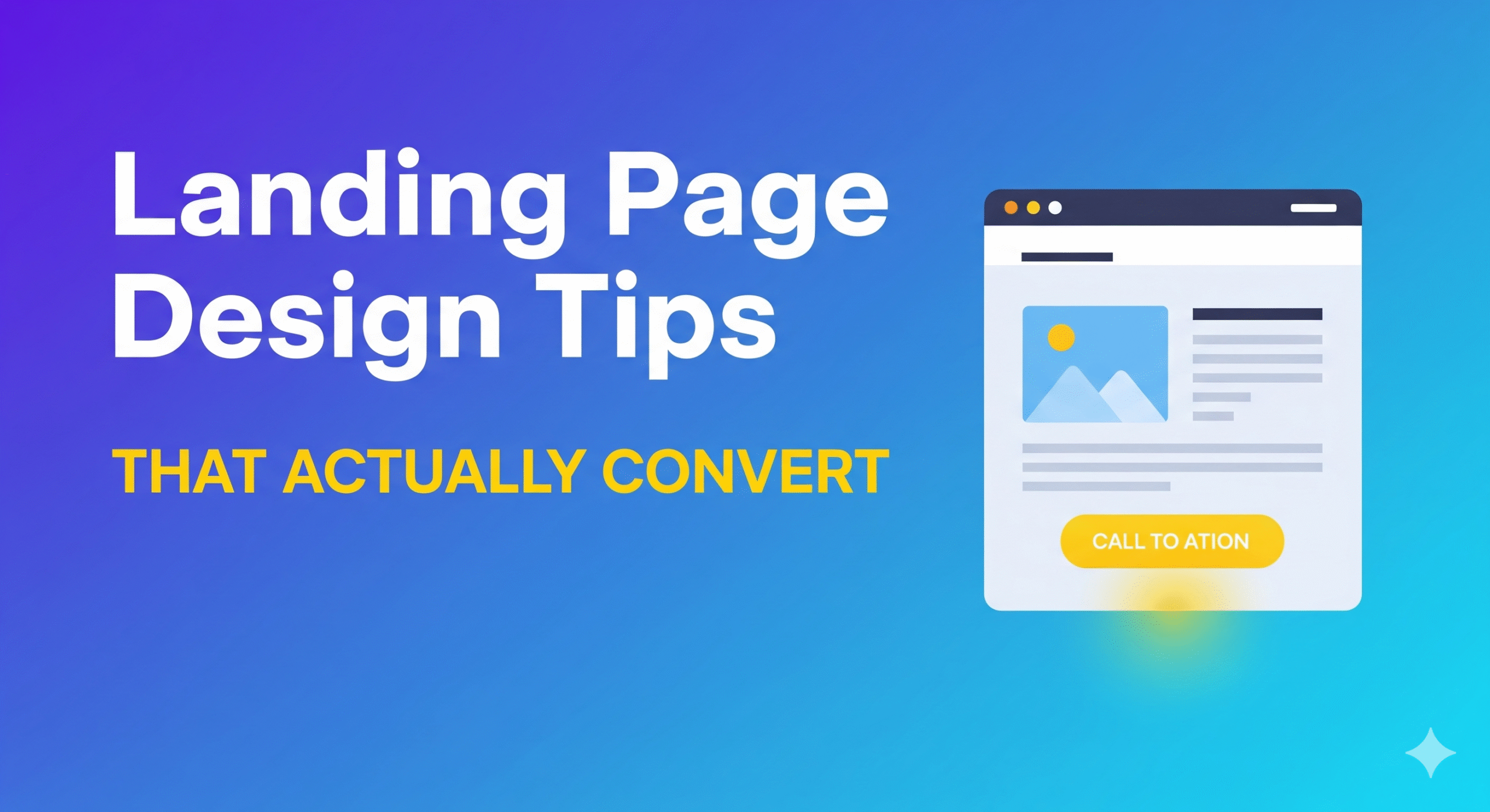
1. Keep It Clean and Focused
When someone hits your page, they shouldn’t feel like they just walked into a garage sale. Too many colors, images, or random links? That’s a recipe for confusion.
People need to instantly understand what you’re offering. Period.
A minimal layout with one clear purpose tends to work better—though I’ll admit, “minimal” can sometimes feel a bit sterile. If you’re pushing a free trial, for instance, don’t muddy the waters with extra navigation menus or sidebar widgets that lead nowhere important. Simplicity might drive clarity, and clarity often leads to conversions. At least, that’s what the conversion rate optimization data suggests.
2. Craft Headlines That Actually Hook People
Your headline is make-or-break territory. Studies indicate that users decide within seconds whether they’ll stick around, and it’s largely based on that first line they see.
Instead of something vague like “Boost Your Business” (which could mean anything), try getting specific. Something like “Double Your Sales in 60 Days with These Marketing Tools” speaks to what people actually want to achieve.
The best headlines seem to answer that crucial question: “What’s in it for me?” If yours doesn’t do that, people will probably scroll away before you know it. That’s why persuasive copywriting matters just as much as design.
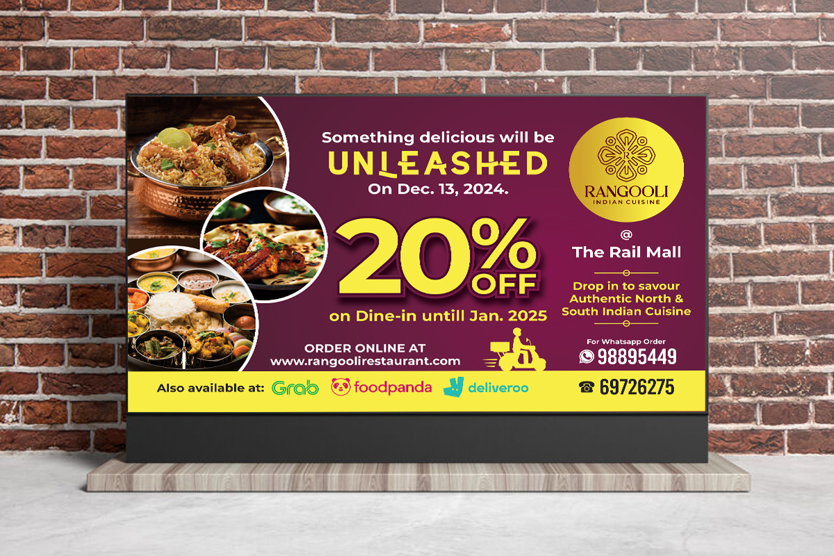
3. Use Visuals That Actually Add Value
Images and videos can definitely make your page more persuasive—when they’re doing actual work. A generic stock photo of people in suits shaking hands? That’s not building trust with anyone.
But a quick product demo video? A customer testimonial clip? Those might seal the deal.
Visual elements should highlight benefits, not just fill empty space. Showing a before-and-after transformation or a brief animation of your product in action generally works better than… well, random images that look like they came from a stock photo catalog. Though I’ve seen some businesses get away with good stock photos if they’re really on-brand.
Adding trust signals like reviews, star ratings, or recognizable client logos alongside visuals makes them far more credible.
4. Make Your Call-to-Action Impossible to Miss
This is where conversions actually happen, yet so many landing pages seem to hide their CTAs or make them look boring as hell.
Your CTA button should be big and bold. Use action words like “Get My Free Trial” or “Start Saving Today” instead of something bland like “Submit.” (Seriously, “Submit” sounds like you’re filling out a tax form.)
Placement matters too—put your main CTA above the fold, and maybe repeat it at key spots throughout the page. That way, when someone’s ready to act, they don’t have to hunt for it.
Smart call-to-action design can literally double sign-ups if done right.
✨ You might enjoy this blog on The Psychology Behind High-Converting CTAs: Why People Click
5. Build Trust with Social Proof
People trust other people way more than they trust businesses. That’s probably not changing anytime soon.
Testimonials, customer reviews, case studies—these can instantly boost your credibility. Here’s what seems to work:
- Star ratings from platforms people recognize
- Short quotes from real customers (not the fake-sounding ones)
- Logos of well-known clients you’ve worked with
Social proof basically tells visitors: “Look, other people have trusted us and didn’t regret it.” That reassurance can be the thing that tips someone over the edge.
Think of it as using customer testimonials as a sales tool.
6. Design for Mobile First (Because Everyone’s on Their Phone)
Most people are browsing on mobile these days. If your landing page looks terrible on a phone, you’re probably losing conversions left and right.
A good mobile-friendly landing page loads quickly, fits the screen properly, and has buttons you can actually tap without zooming in. Keep forms short too—nobody wants to fill out fifteen fields on their phone while they’re standing in line for coffee.
Plus, Google seems to favor responsive web design in search rankings. So it’s not just about user experience anymore; it’s about being found in the first place.
7. Test, Tweak, and Keep Improving
No landing page is perfect right out of the gate. That’s where A/B testing comes in handy.
Try experimenting with different headlines, button colors, form lengths, or image placements. Even tiny changes can lead to surprising improvements. I read about one business that changed their CTA button from green to orange and saw a 21% jump in sign-ups. Could be a fluke, but it shows how A/B testing strategies can reveal what actually resonates with your audience.
Testing is the backbone of landing page best practices—you’re never done optimizing.
Why Some Businesses Go with Professional Web Design Services
Designing a landing page might look straightforward, but there’s usually more going on behind the scenes than meets the eye. Understanding user behavior, conversion psychology, how colors and layouts work together—it gets complex pretty quickly.
That’s probably why many businesses end up hiring web design services. A good team doesn’t just make things look nice—they optimize for speed, website loading performance, and the psychological triggers that influence decisions.
It can save you months of trial and error, especially if you’re in a competitive space. Though it’s worth noting that professional services aren’t always a silver bullet—I’ve seen some expensive designs that converted worse than simpler, DIY versions.
Frequently Asked Questions
What’s the main difference between a landing page and a homepage?
A homepage tries to cover everything about your brand. A landing page has one job—getting people to take a specific action, like signing up or making a purchase. This is why homepage vs landing page matters in digital marketing.
How many CTAs should a landing page have?
Probably just one main call-to-action. Too many options can confuse people and hurt your conversion rates. Though some pages do well with a primary CTA and maybe one secondary action.
Do visuals really make that much difference?
They can. Relevant images and videos often boost trust and help people understand what you’re offering faster. But random visuals can actually distract and hurt conversions, so choose carefully.
How important is mobile optimization?
Pretty crucial. Most traffic comes from mobile devices now, and Google favors mobile-friendly sites. Without proper optimization, you’re likely losing both traffic and conversions.
Can professional web design services actually improve conversion rates?
They might. Good designers understand user experience design, conversion principles, and technical optimization. However, results can vary; sometimes, a simple, focused page outperforms an expensive custom design.
Final Thoughts
A landing page is more than a digital brochure—it’s supposed to be a conversion machine. Clean design, compelling headlines, relevant visuals, trust signals, and a clear CTA all work together to turn visitors into customers.
If you’re serious about boosting conversions, start with these basics. When you’re ready to scale up, professional design services might be worth considering. But honestly? Sometimes the simplest approach works best.


