Pick up a brochure and you can usually tell within five seconds if it’s doing its job. A good one feels polished, clear, and easy to read—it pulls you in, guides you through, and leaves you curious to know more. A bad one, though? It ends up in the recycling bin faster than you can say “marketing collateral.”
That’s why brochure design services matter. They don’t just “make something look nice.” Done right, they turn folded paper (or digital PDFs) into powerful storytelling tools. But plenty of brands—big and small—still fall into the same traps. From cluttered layouts to missing CTAs, these mistakes can turn even the best ideas into wasted effort.
So let’s get real about the 10 most common brochure design mistakes and how to sidestep them.
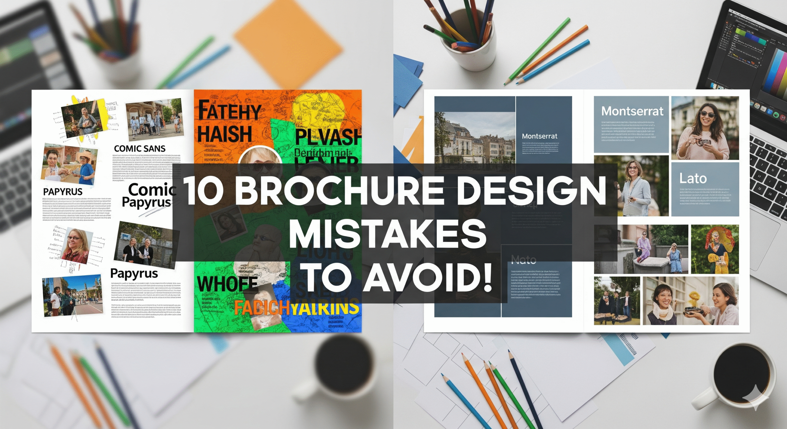
1. Overloading Content
You’ve probably seen this one before: a tri-fold brochure with walls of text, bullet points that run for days, and a mission statement squeezed into every panel. It’s like someone tried to publish a mini-novel on glossy stock.
Here’s the problem: brochures aren’t encyclopedias. They’re appetizers. They should give readers just enough to get curious—not overwhelm them with every detail.
Think of a company profile brochure. It doesn’t need your entire 20-year history, every product line, and a full team directory. Instead, focus on highlights. Use sharp subheadings, short paragraphs, and visuals to break up text.
Brochure design services often recommend the “30-second rule”: a brochure should communicate its main message in half a minute. Anything beyond that risks losing the reader.
2. Ignoring White Space
Some businesses panic at the sight of blank areas. They fill every gap with text, charts, or clip art. But here’s the truth—white space isn’t wasted space. It’s breathing room.
Look at travel brochures from luxury agencies. They’ll often show a single, full-page image of a destination with just a few words. That’s not laziness—it’s intentional design. White space creates focus. It tells your reader: “Look here. This matters.”
Professional brochures rely on spacing to give rhythm and flow. Without it, everything feels cramped and overwhelming. If you want people to read your copy, don’t suffocate it.
3. Forgetting the Audience
One of the biggest missteps? Designing a brochure without thinking about who it’s for.
A healthcare brochure for patients should be warm, clear, and reassuring—not filled with medical jargon. A business brochure aimed at investors should highlight growth, numbers, and credibility. An event brochure for a festival should feel energetic and colorful.
Skipping audience research is like giving a speech without knowing who’s in the room. Brochure design services usually start with audience profiling for this reason—it shapes tone, content, and layout.
4. Weak Headlines That Fail to Hook
Your headline is the handshake. If it’s limp, people walk away.
Too many brochures settle for bland titles like “About Us” or “Our Services.” Compare that to something like:
-
“Smart Solutions for Complex Problems”
-
“Discover Homes That Fit Your Lifestyle”
The difference? One is generic. The other promises value.
For sales brochure design, headlines should grab attention right away. Think bold, benefit-driven, and specific. That single line on the front panel determines whether someone flips the page or tosses it aside.
5. Poor-Quality Visuals
You know what kills trust fast? Blurry logos, stretched images, and cheap stock photos.
Imagine a real estate brochure showing million-dollar homes with pixelated photos. Or a product brochure displaying blurry images of tech gadgets. Not exactly confidence-building, right?
Visuals are make-or-break. Use high-resolution images—preferably original photography. If budget is tight, there are affordable stock platforms like Adobe Stock or Unsplash. Just make sure the images match your brand tone.
Pro tip: don’t forget about iconography and infographics. Graphic design services can turn data into visuals that feel polished and easy to understand.
6. Overcomplicated Layouts
Creativity is a plus—confusion is not.
Some brochures zigzag with text running diagonally, overlapping images, and clashing fonts. The result? Readers don’t know where to look first.
Good brochure design follows flow. Eyes should move naturally left to right, top to bottom. Grid systems are your friend. Tri-fold brochures, bi-fold brochures, and digital brochures all work best with layouts that guide—not challenge—the reader.
Here’s the thing: simple doesn’t mean boring. It means intuitive. Professional brochure design services balance creativity with usability.
7. Forgetting the Call-to-Action
This one’s a silent killer. A brochure that doesn’t tell readers what to do next is wasted potential.
A marketing brochure should say:
-
“Book your free consultation.”
-
“Visit our store today.”
-
“Scan this QR code for exclusive offers.”
Without a clear CTA, you’re leaving readers at the door without telling them where to go. Sales brochure design isn’t just about informing—it’s about converting.
8. Inconsistent Branding
Picture this: your website uses navy blue and clean typography. But your brochure shows bright green with cursive fonts. Confusing, right?
Brochures are part of your branding materials. They should align with everything else—business cards, websites, flyers, even social media. Inconsistent branding doesn’t just look sloppy—it erodes trust.
Whether you’re creating corporate brochures or promotional brochures, make sure colors, fonts, and tone reflect your identity. Brochure design services often use brand style guides for this exact reason.
9. Cutting Corners on Printing
You can have the most stunning design, but if you print on flimsy paper with faded ink, the impression is gone.
A luxury event brochure printed on cheap stock feels out of place. A company profile brochure that smudges easily sends the wrong message.
Printing services matter. Choose stock and finishes that match your brand. Glossy for vibrancy, matte for sophistication, textured for uniqueness. Affordable brochure printing doesn’t mean low quality—it means smart choices. If budget is tight, print fewer copies at higher quality.
10. Neglecting Digital Brochures
This mistake feels almost outdated, but it still happens. Businesses design only for print, then slap a flat PDF online.
Digital brochures can do so much more: clickable links, embedded videos, animations, even virtual tours. Imagine a travel brochure with a 360° view of a destination, or a real estate brochure with a virtual property walk-through.
Custom brochure design services now treat print and digital as equally important. Neglecting one side means you’re ignoring part of your audience.
Quick Sidebar: Brochure vs Flyer
People often confuse brochures with flyers, but they’re not the same. Flyers are one-page, short-term tools—perfect for retail discounts or local events. Brochures are multi-fold, detailed, and built for long-term impact—great for company profiles, product lines, or travel packages.
Knowing when to use each matters. Flyer and brochure printing can complement each other, but don’t substitute one for the other.
Why These Mistakes Hurt
Here’s the bottom line: brochures aren’t just paper. They’re brand representatives. They sit on desks, travel home in bags, and sometimes even get pinned to boards. A bad brochure isn’t harmless—it’s a brand liability.
Whether you’re a school looking to attract students, a healthcare provider explaining services, or a business pitching investors, brochures are silent salespeople. And you wouldn’t send a salesperson out poorly dressed and unprepared, would you?
Final Thoughts
Avoiding these mistakes isn’t complicated. It’s about balance, consistency, and intention. Professional brochure design services make sure every element—copy, visuals, layout, printing—works together.
Because here’s the truth: brochures still work. They’re tactile, personal, and persuasive in a way digital ads often aren’t. Done well, they don’t just inform; they connect. They start conversations. They stick around long after the first impression.
So the next time you’re planning business brochures, event brochures, or custom brochure design services, remember: brochures aren’t filler. They’re conversations in print. Make yours worth keeping.