I was walking through Times Square last month when something clicked. Before I even read a single name, I knew which brands were around me — Coca-Cola’s red, the deep blue of a banking billboard, a green Starbucks cup poking out of someone’s tote. Those colours weren’t random. They’re doing work.
At first glance colour choice looks like a simple design decision. In practice it’s a kind of shorthand that taps emotions, memories, and cultural cues — often below the level of conscious thought. Pick the right shade and people feel something toward your brand almost instantly; pick the wrong one and you risk looking off-brand or, worse, confusing people.
Why colour shapes what we think
People form impressions fast — within the first moments of seeing a product — and a lot of that snap judgment is driven by colour. Part of the reason is biological: colour processing links into brain systems tied to emotion and memory, so a sight can trigger feelings tied to past experiences. Red, for example, often feels urgent because it’s associated with blood and fire; blue tends to feel calming because it calls to mind open skies or still water. Yellow can read as cheerful because of sunlight; green often signals nature and growth.
That’s not universal, though. Cultural context matters. White reads as clean and clinical in many Western contexts, which is why hospitals and labs lean on it, but in some Eastern cultures white can signal mourning. Red is lucky in China and celebratory at festivals, while in parts of the West it can mean danger or an urgent sale. So, a colour that “works” in one market may misfire in another.
A quick tour through the emotional palettes
Red: attention and action, with caveats
Red grabs attention; it’s why food apps, streaming services and clearance tags use it to create energy or urgency. But it comes with a double edge: the same colour can also feel aggressive or overstimulating. A meditation app or a retirement fund probably shouldn’t rely on a bold vermillion logo.
Blue: the default for trust
A large share of major brands chooses blue because it tends to project steadiness and reliability. Think banks, enterprise tools, and professional networks. Darker navy leans authoritative; pale blues feel lighter and more youthful. Still, blue isn’t a magic bullet — relying on it because “everyone else does” can make you forget how to communicate what’s uniquely yours.
Green: growth, health, money
Green reads as natural and restorative; it’s common among eco-brands, outdoor products, and sometimes finance (thanks to cultural ties between green and money). It also tends to be easy on the eyes, which can make interfaces feel calm. But overusing literal “leafy” green visuals can feel clichéd unless the brand has a genuine environmental story.
Purple: creative and premium, sometimes odd
Historically linked to royalty, purple can suggest quality or imagination. It sits between warm and cool tones, so it can balance energy and calm. That said, purple can also look theatrical or niche — it works best when the rest of the brand supports that personality.
Black & white: quiet confidence or starkness
Monochrome can communicate simplicity and premium positioning; it’s the look many luxury and tech brands favour for a reason. But monochrome can feel austere if it isn’t warmed up with copy, typography, or a clear product story.
Yellow: bright but fragile.
Yellow stands out and can feel friendly, yet it’s easy to misuse: too much yellow fatigues the eye, and in the wrong context it can read as cheap. Smart brands use yellow as an accent (think of a CTA button or a ticket stub), not a full identity unless there’s a strong reason.
How industries tend to use colour (and why)
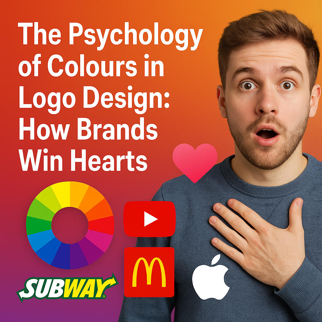
Fast-food brands learned early that certain combos — red and yellow — stimulate appetite and action. Luxury labels go quiet: muted blacks, golds, and creams whisper exclusivity. Health fields skew toward whites and blues to suggest cleanliness. Tech companies wrestle with two needs at once: to feel fresh and to feel trustworthy, which explains why many of them opt for blues or blue-adjacent palettes.
But conventions aren’t rules. Choosing a colour outside your category can help you stand out — and it can hurt you. It’s a strategic gamble.
Practical steps for choosing colours that actually work
Define your brand personality honestly. Are you playful, pragmatic, niche, mass market? Your colour choices should match that voice. Know your audience. Age, geography, and cultural background change how colours read. A palette that resonates with urban millennials might not land with older suburban customers.
Think through real use cases. How will your logo look on a tiny mobile icon, a shipping box, or black-and-white photocopies? Will the contrast be sufficient for people with common colour vision differences (for instance, many folks have red-green confusion)?
Test on actual people. Run simple A/B test, try a navy button versus a teal one, or compare a soft green homepage header with a more saturated tone, and watch behaviour, not just preference. You may be surprised what a small shade tweak does to click rates or sign-ups.
Don’t follow trends blindly. Rebrands are costly. Chasing whatever Pantone names “Colour of the Year” is rarely the best strategic move.
🫵 If you think it is too much to overanalyze colours and worry about every shade, don’t. Just Check out our “Logo Design Service” and let us handle it for you.
Common mistakes to watch for
Relying on trends rather than strategy, so you end up rebranding again in two years.
Ignoring how colours translate across media — some screens render hues differently than offset print.
Overcomplicating the palette until nothing reads clearly at small scale.
Missing accessibility: low contrast excludes customers who have trouble distinguishing colours.
Forgetting cultural signals, which can alienate key markets.
Where colour might go next
As screens and environments change, brands are experimenting with more dynamic colour systems, think palettes that shift for dark mode, or personalized themes tied to user behavior. Virtual reality and AR open possibilities for immersive colour experiences that respond to context. There’s also growing interest in choosing dyes and processes that are kinder to the environment, which nudges some brands toward colours and finishes that photograph well in natural light and are easier to reproduce sustainably.
A final, practical thought
Colour isn’t decoration. It’s a communication tool that works quietly, sometimes powerfully. For small businesses it’s a way to punch above their weight and feel memorable. For larger companies, consistent colour choices keep global recognition humming.