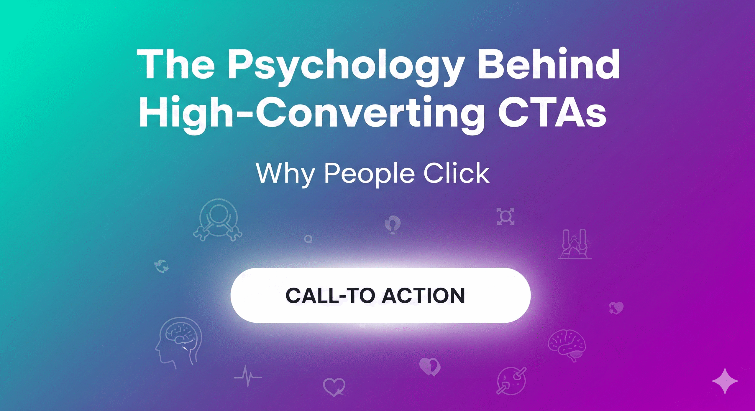
You know that moment when you’re browsing online and suddenly find yourself clicking a button you hadn’t planned to click? Maybe it said “Grab Your Free Trial” instead of the usual boring “Submit.” Or perhaps it appeared right when you were getting ready to close the tab.
That’s probably not accident—it’s likely psychology at work.
I’ve noticed that the CTAs that actually get clicks seem to tap into how our brains are wired to think and make decisions. When you combine these psychological nudges with decent design, Search Engine Optimization, and some smart use of CTA Psychology, businesses can guide people toward taking action. Whether that’s buying something, filling out a form, or booking a consultation.
Let me walk through what appears to make High-Converting CTAs so compelling (and why some fall completely flat).
Why CTAs Matter More Than We Think
Here’s the thing—a call-to-action isn’t really just a button. It’s more like the final push after you’ve gotten someone interested and built a bit of trust. Without a clear CTA, even the most beautifully designed website just leaves people hanging, unsure what to do next.
I tend to think of CTAs as tiny decision points. Each click represents someone choosing to trust you, take a small risk, maybe invest some time or money. The better we understand that split-second decision-making process, the more likely we can create buttons that actually work.
What Makes People Click (The Psychology Part)
From what I’ve observed, there are several psychological triggers that seem to drive clicks:
The Fear of Missing Out Thing
We humans really hate missing opportunities. When you see “Offer ends tonight” or “Only 5 spots remaining,” it hits something called loss aversion. Basically, we’re more motivated by not losing something than by gaining it.
Amazon does this well with their “Only 2 left in stock” messages. It’s not overly pushy, but it creates just enough urgency.
Our Brain’s Love of Simplicity
Our minds crave clarity. A CTA like “Get My Free Guide” cuts straight to the point. Compare that with something like “Learn More About Our Comprehensive Special Promotional Offer Here”—way too wordy and vague.
Dropbox nailed this years ago with their simple “Sign up for free.” Short, clear, low risk.
Emotions Beat Logic (Usually)
This might surprise some people, but feelings drive clicks more than rational thinking. Words like “unlock,” “discover,” “save,” or “protect” spark curiosity and desire in ways that bland corporate language just doesn’t.
This is where Emotional Triggers in Marketing really shine. Headspace does this nicely with “Get Some Headspace” rather than just “Subscribe to Our Service.”
The “Everyone Else is Doing It” Factor
Social proof is powerful. When we see “Join 20,000+ marketers” or testimonials near a CTA, it taps into our tendency to follow the crowd. We figure if that many people are doing something, it’s probably worth doing.
The Comparison Game
Here’s something interesting—if you show a premium product for $199 first, then offer a “Start with Basic for Free” option below it, that free choice suddenly looks amazing. Our brains love having something to compare against.
How CTAs Connect With SEO and Design (The Technical Side)
This part might seem obvious, but CTAs actually affect more than just conversions. They can influence how search engines view your site too.
When people actually engage with your CTAs, it sends positive signals—longer time on page, lower bounce rates, more interaction. Google seems to notice these things when ranking sites. That’s why Conversion Rate Optimization and CTA performance go hand in hand with SEO.
On the design front, a gorgeous CTA is pretty useless if it’s buried in clutter or hard to find. Good Web Design Services make sure CTAs are visible and intuitive. The placement, color contrast, white space around it—all of this matters for both conversions and user experience.
So in a way: Search Engine Optimization gets people to your site, design keeps them interested, and CTAs seal the deal.
Practical Stuff That Actually Works
Based on what I’ve seen work (and fail), here are some approaches worth trying:
-
Action words work better → “Download Now,” “Reserve My Spot,” “Get Instant Access”
-
Reduce the perceived risk → “No Credit Card Required,” “Cancel Anytime”
-
Make it personal → Instead of “Get Started,” try “Start Your Free Trial”
-
Make it stand out visually → Bright colors and plenty of white space help
-
Test everything → What clicks with one audience might bomb with another
These are some of the most reliable Call-to-Action Best Practices I’ve noticed across industries.
Matching CTAs to What People Actually Want
Different visitors are looking for different things, and your CTAs should probably reflect that:
-
Blog readers (just learning) might respond to “Download our free guide”
-
People searching for your brand specifically might want “View Pricing” or “See Features”
-
Ready-to-buy visitors need strong CTAs like “Buy Now” or “Book a Demo”
The key seems to be meeting people where they are in their buying journey, not where you want them to be. That’s the core of Why People Click in the first place.
Some Questions I Get About CTA Psychology
Why do perfectly designed CTAs sometimes still fail?
Usually because they don’t match what the visitor actually wants. If someone’s still researching, a pushy “Buy Now” button feels premature.
Should every page have the same CTA?
Probably not. Context matters a lot. Blog posts might need gentler CTAs while product pages can be more direct.
Do button colors really make a difference?
Yes and no. It’s less about red vs. green and more about contrast with the rest of your page. A blue button works great on a white site but might disappear on a blue background.
How do CTAs help with SEO?
Indirectly. Better engagement usually means better signals for Google. Pages with clear CTAs often keep visitors around longer, which can help with rankings.
Is one CTA per page the rule?
Generally, yes—but on longer pages, it makes sense to repeat the same CTA at different points. You want to catch people when they’re ready, wherever that happens to be.
Wrapping This Up
High-Converting CTAs don’t just happen by accident. They’re built on understanding CTA Psychology, tested with real data, and refined through good design. When you combine this with solid Search Engine Optimization and decent Web Design Services, CTAs become more than just buttons—they turn into actual conversion tools.
If you want visitors to do more than just browse your site, you can’t just ask politely. You need to guide them, give them a reason to act, and make it feel like the obvious next step.
After all, the right CTA isn’t really about the button itself—it’s about opening the door to whatever comes next for your business.
👉 You may like this blog about Why Website Redesign Is Sometimes Better Than a Small Fix.